Institutional website

A clearer website for communicating filtration expertise.

Urufiltros already had a website, but it did not represent or amplify the company's technical level. We transformed that presence into a clearer, more professional experience built to create trust.

Read summary

Project snapshot

Client
Urufiltros
Year
2025
Scope
Brand manual, visual redesign, UX/UI and web development
Role
Strategy, design and frontend

What we did

Technical trust, easier to understand.

The starting point was not creating a presence from nothing, but improving something already published that was not working hard enough for the brand. We developed a brand manual with logo, palette, typography and applications, then carried that direction into a clearer, more professional and contact-focused website.
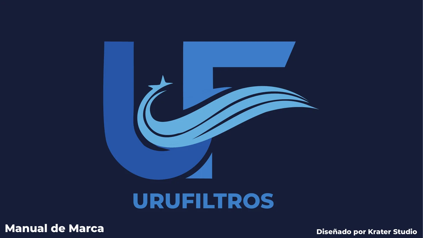
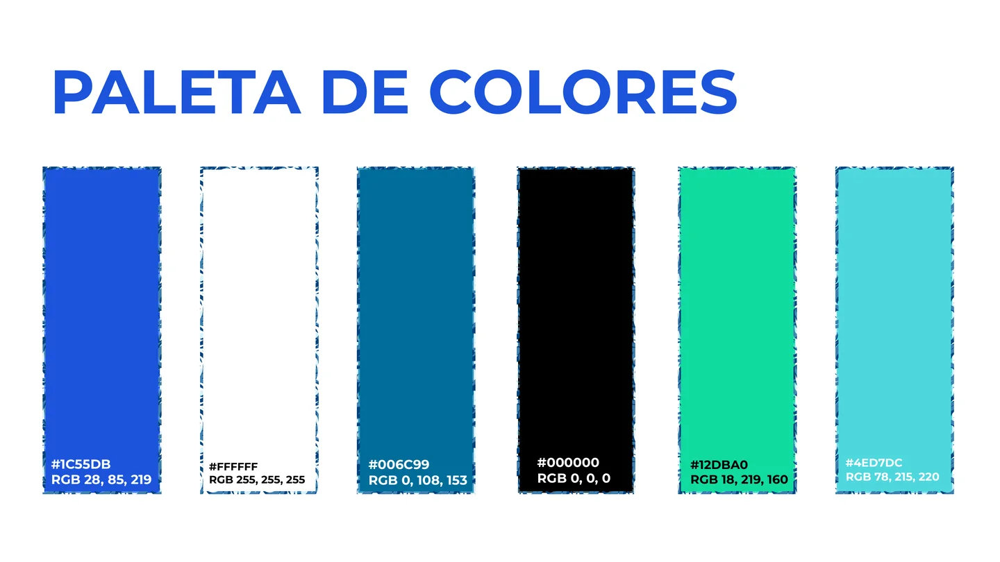
Brand redesign

A manual that keeps the identity consistent across every touchpoint.

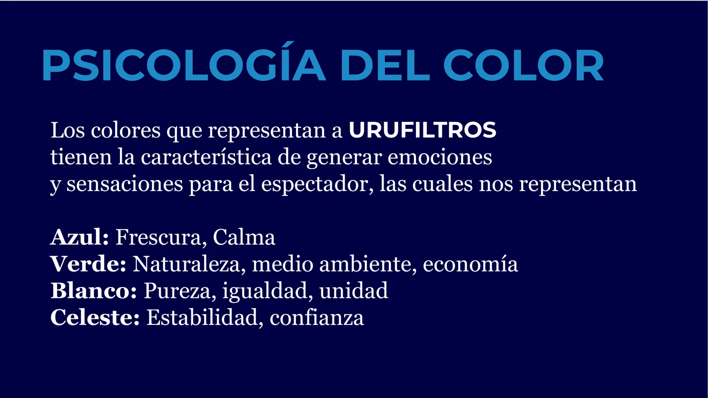
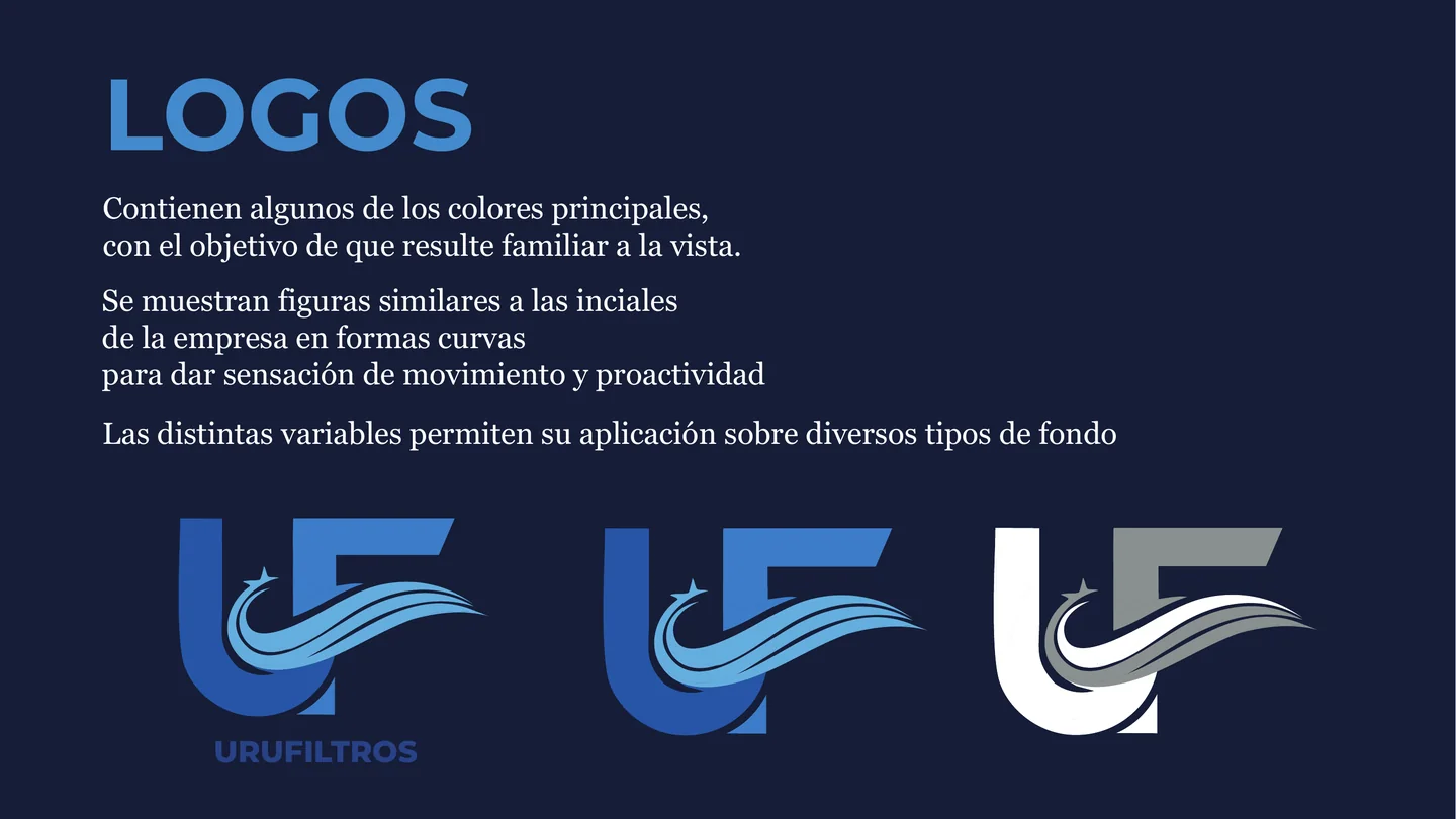
The manual documents Urufiltros' new visual universe: logo, variants, palette, color psychology, color hierarchy, typography and applications. The brand combines curved forms that suggest movement and proactivity with a palette connected to clean air, nature and trust.

  • Logo and variant system
  • Palette with RGB and hex codes
  • Color psychology
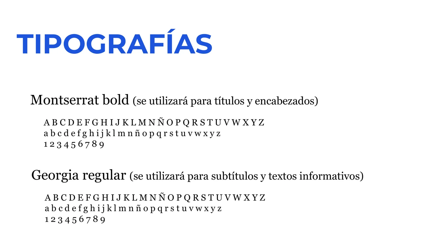
  • Montserrat Bold and Georgia Regular
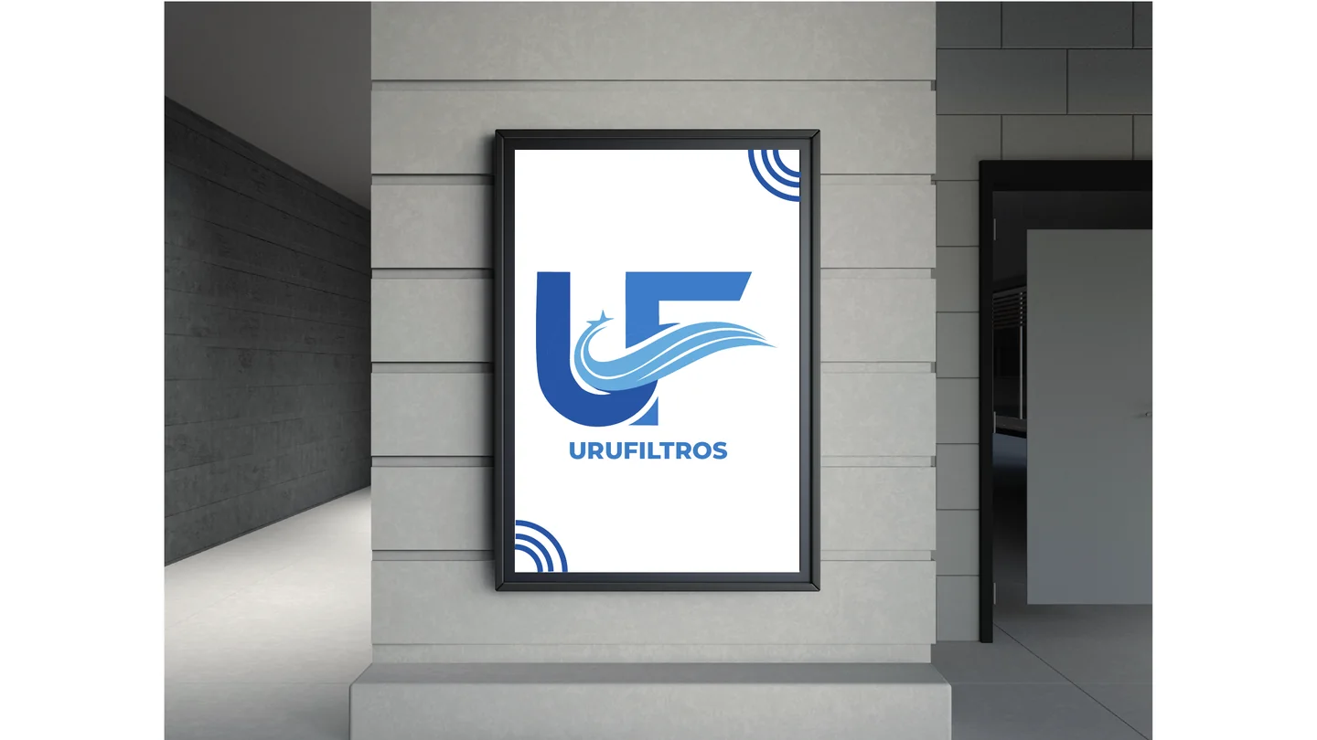
  • Brand applications

Website

A clear website for services, products and certifications.

The live site organizes the experience around one main promise: air filtration experts. Navigation prioritizes services, products, clients, track record and contact, with direct calls to request a quote and write through WhatsApp.

Visit live site

URUFILTROS

A clear website for services, products and certifications.

+30 years of experienceCertified productsService in Uruguay
Biosafety cabinetsLaminar flowPressurized gasesClean rooms

Testimonial

The client's voice

Client testimonial

Working with Krater was a very simple, flexible and professional experience. Even though we did not have much knowledge about social media or web development, we were able to share what we imagined and the team translated it with great clarity, just as we had pictured it. We are very happy with the result and with the service we received.

MartinaDirector at Urufiltros
01

The challenge

The previous site existed, but it did not communicate Urufiltros' track record, specialization or technical trust strongly enough. The brand needed to move from simply being online to presenting itself with more intention.

02

The solution

We redesigned the identity and reorganized the website to turn a basic presence into a stronger institutional platform, with clearer hierarchy, sharper messaging and more direct contact paths.

03

The result

A modern institutional website that better represents what the company already was, communicates its value faster and turns an underused digital presence into a more useful commercial tool.

Visual direction

Color system

Primary Blue

#4E86F7

#1C55DB. Core recognition color for freshness and institutional presence.

Petrol Blue

#2FA8D6

#006C99. Technical depth for sections, contrast and hierarchy.

Nature Green

#12DBA0

#12DBA0. Environmental accent connected to nature, economy and care.

Purity White

#FFFFFF

#FFFFFF. Clean base for order, clarity and a sense of purity.

Typography

Montserrat Bold

Georgia Regular

Montserrat Bold was defined for titles and headers because of its institutional strength; Georgia Regular supports subtitles and informational text with a clear, trustworthy reading tone.

Key moves

  • Brand manual with logo, palette, color psychology, typography and applications.
  • Visual system based on freshness, calm, nature, purity, stability and trust.
  • Institutional website focused on specialized services and certified products.
  • Conversion paths oriented to quote requests, contact and WhatsApp.

Deliverables

  • Brand manual
  • Logo system and variants
  • Palette and typography
  • Responsive institutional website
  • Services and products structure