Ecommerce

An online stationery store built to browse, find and buy fast.

Medimark is a stationery shop selling notebooks, pens and school supplies. We gave it a brand and an online store that sells on its own.

Read summary

Project snapshot

Client
Medimark
Year
2025
Scope
Identity, visual system and ecommerce development
Role
Design and frontend

What we did

An online store built from scratch.

Medimark did not have an ecommerce platform before: we built the full channel from the ground up so the brand could sell with more order, clarity and autonomy. We designed the category structure, navigation, product pages, cart and user access so each customer could find what they needed without relying on manual questions. The store was planned as a real commercial tool: easier to browse, simpler to update and better prepared to support offers, school seasons and catalog growth.
Online store

A simple ecommerce experience that is easy to browse.

Medimark's experience prioritizes clear categories, visible search, products with prices at first glance, an organized cart and user access so each purchase takes only a few decisions.

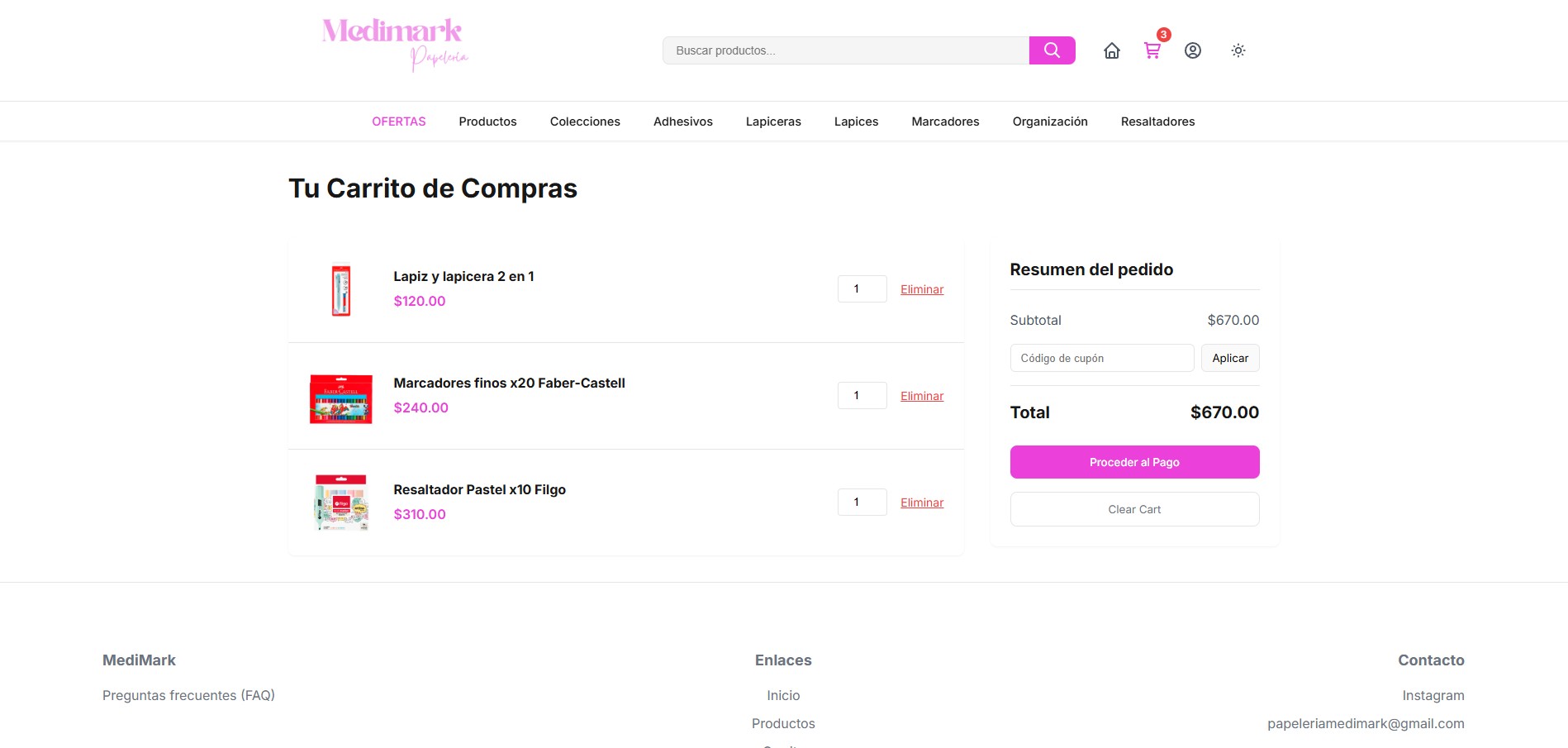
Shopping cart
Shopping cartThe order summary stays clear, with subtotal, coupon and checkout action.
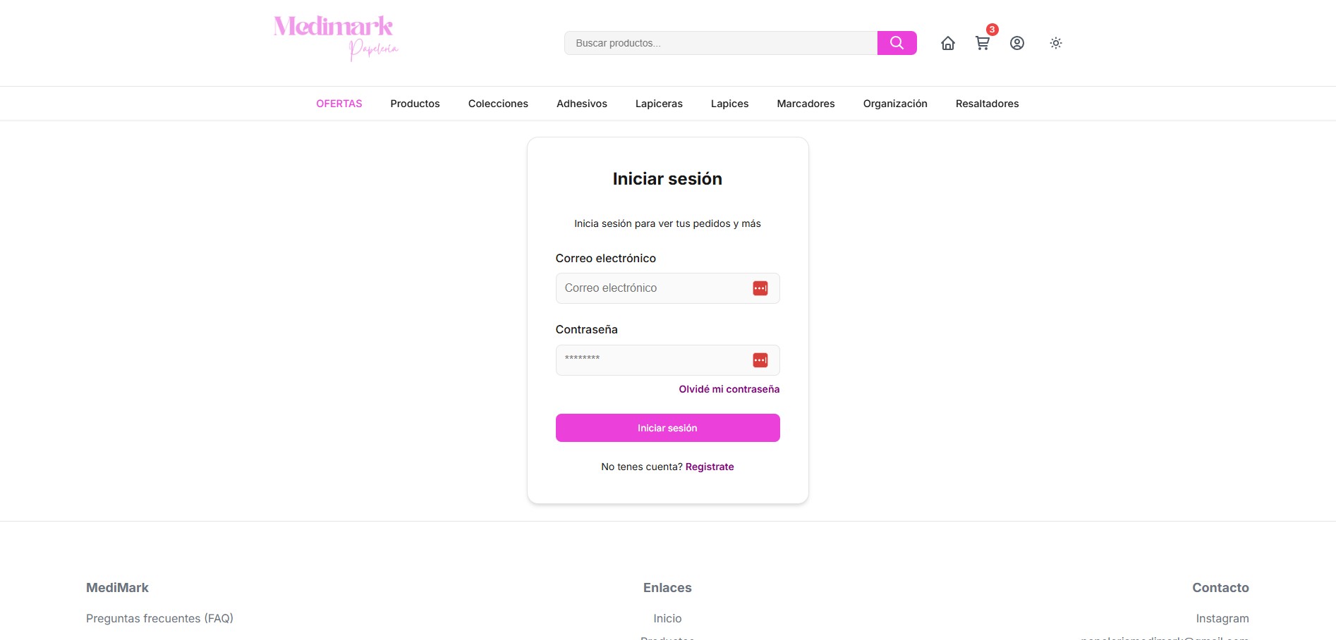
Sign in
Sign inThe user account keeps orders and data in a clean, direct screen.
01

The starting point

Medimark needed to move from a workflow driven by manual questions to its own channel, where customers could explore products, compare options and move toward purchase without waiting for a reply.

02

The store from scratch

We designed and developed the full ecommerce experience: navigation structure, categories, search, product pages, cart, user account and a visual base aligned with the stationery shop's friendly tone.

03

Business impact

The store gives Medimark its own space to show product variety, organize orders, reduce repeated questions and activate offers or campaigns without rebuilding communication every time.

Visual direction

Color system

Medimark Pink

#E63BD2

#E63BD2. Primary color for search, purchase actions and brand recognition.

Soft Pink

#F7A8E8

#F7A8E8. Supporting tone for the logo, visual details and warmer moments.

Warm Coral

#F25B6A

#F25B6A. Accent for notifications, active states and cart messages.

Shop White

#FFF8FC

#FFF8FC. Clean background that keeps products and actions easy to read.

Typography

Fraunces

Inter

Fraunces gets closer to the editorial, feminine character of the logo; Inter keeps navigation, products, prices and forms simple and orderly.

Key moves

  • Product catalog organized by category and everyday use.
  • Product sheets with photos, prices and stock at a glance.
  • Cart and checkout designed for quick, low-friction purchases.
  • Store the client can update alone, straight from a phone.

Deliverables

  • Visual identity
  • Color and typography system
  • Online store (ecommerce)
  • Catalog and category structure
  • Application guidelines